In This Article
As an essential aspect of data analysis, data visualization is best presented interactively, which is why Plotly has become a popular library for creating interactive charts and graphs.
The dropdown menu feature in Plotly is particularly useful for filtering data and creating more dynamic visualizations.
It allows users to interact with the data and customize the visualization to their needs. However, the question is How do we use the Plotly dropdown filter data in Python?
Introduction
In this tutorial, we will demonstrate how we can use the Plotly dropdown feature in Python to create an interactive pie chart showcasing the market share of different operating systems.
We will start by importing the necessary libraries and loading the data into our Python environment.
Then, we will use the Plotly dropdown menu to filter the data by operating system and create a pie chart that shows the market share for each OS.
By the end of this tutorial, you will have a better understanding of how to use the Plotly dropdown menu to create interactive data visualizations that can be customized to meet your specific needs.
So let’s dive in and start exploring the power of the Plotly drop down!
Importing Data from a CSV File into a DataFrame
To import the data from a CSV file into a DataFrame, we’ll make use of the Pandas library in Python.
Start by importing the pandas module:
import pandas as pd
Next, we will use the read_csv() method from pandas to load the data from the CSV file into a DataFrame.
Here, we will be using the OS market share data downloaded from https://gs.statcounter.com/os-market-share.
The CSV file is named os_combined-ww-monthly-202204-202304.csv.
df = pd.read_csv("os_combined-ww-monthly-202204-202304.csv")
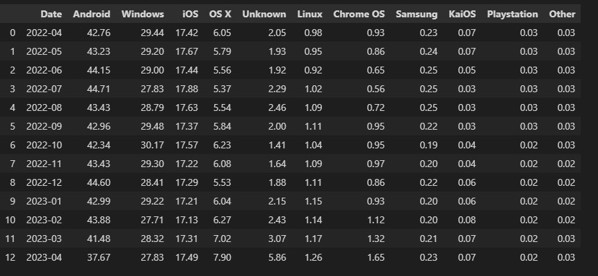
Now that we have loaded the data into a DataFrame named df, let’s take a look at the data:
df
Output:
Preparing the Data for Plotting
Before we can plot the data using Plotly dropdown filters, we need to prepare the data by performing some necessary transformations and filtering.
In this section, we will go through the steps to prepare the data for plotting.
"Date" column to datetime format and filter the DataFrame accordingly:# Filter every other year except 2022
df["Date"] = pd.to_datetime(df["Date"])
df = df[df["Date"].dt.year == 2022]
Here’s our filtered dataframe:
df
Output:

Next, we want to ensure that the numeric columns are of the appropriate data type for plotting. We will convert all columns except the "Date" column to numeric:
# Make sure the columns are numeric, except for the "Date" column
columns_to_convert = df.columns.difference(["Date"])
df = df.copy()  # To avoid SettingWithCopy warning
df[columns_to_convert] = df[columns_to_convert].apply(pd.to_numeric)
In our data, we have several columns representing different operating systems.
To simplify the visualization, let’s sum these columns into a single "Others" column.
We will create a new column named "Others" that contains the sum of the columns ["OS X", "Unknown", "Linux", "Chrome OS", "Samsung", "KaiOS", "Playstation", "Other"]:
df = df.copy()  # To avoid SettingWithCopy warning

columns_to_sum = ["OS X", "Unknown", "Linux", "Chrome OS", "Samsung", "KaiOS", "Playstation", "Other"]
df.loc[:, "Others"] = df[columns_to_sum].sum(axis=1)
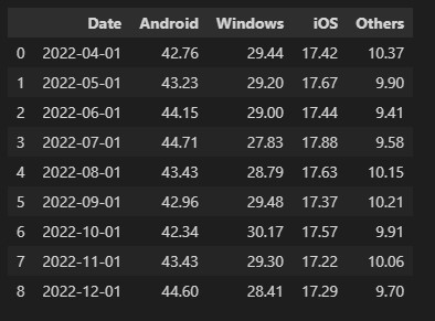
Lastly, we can drop the unnecessary columns from the DataFrame to focus on the main operating systems we want to plot, namely "Android", "Windows", "iOS", and "Others":
df = df.drop(["OS X", "Unknown", "Linux", "Chrome OS", "Samsung", "KaiOS", "Playstation", "Other"], axis=1)
Now, our final dataframe looks like what you see below:
df
Output:
After completing the necessary data preparations, we successfully transformed the original DataFrame into a suitable format for utilizing Plotly dropdown data filters in Python.
With these preparations in place, we can now move forward to the plotting phase, where we will use the feature of Plotly drop down to filter data.
Plotting the Pie Chart using Plotly
Now that we have prepared the data, we can proceed to plot the pie chart using Plotly.
The pie chart will visually represent the distribution of operating systems for each month.
To enable selecting different months for the pie chart, we will use the "Date" column to generate a list of dropdown options.
Each option will be formatted as the month and year:
# Generating dropdown options from the "Date" column
months = df['Date'].dt.strftime('%B %Y').tolist()
months
Output:
['April 2022',
 'May 2022',
 'June 2022',
 'July 2022',
 'August 2022',
 'September 2022',
 'October 2022',
 'November 2022',
 'December 2022']
For each pie chart, we need to extract the labels and values.
The labels will be the column names, excluding the "Date" column and the values will be the corresponding data for each month:
# Extracting labels and values for each pie chart
labels = df.columns.tolist()[1:]  # Pie labels (for each pie chart slice)
values = [
    df.iloc[i].tolist()[1:]
    for i in range(len(months))
]  # Values (for each pie chart)
We will use Plotly go.Pie() function to create pie chart objects. Then We will iterate through the values list to generate pie chart objects for each month:
import plotly.graph_objects as go

# Creating pie chart objects
piecharts = [
    go.Pie(
        labels=labels,
        values=values[i]
    )
    for i in range(len(values))
]

# Creating the figure and updating layout
fig = go.Figure(data=piecharts)
fig = fig.update_layout(title=months[0])

# Displaying the pie chart
fig.show()
Output:
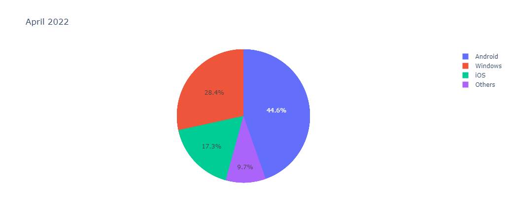
By executing these code cells, we will generate a pie chart with the initial month’s data. The chart will showcase the distribution of operating systems for that particular month.
Next, we want to use the Plotly dropdown filter data. We will add a dropdown menu to allow us to select different months and update the pie chart accordingly.
Adding the Plotly dropdown to filter data
To enhance the interactivity of our plot, we will add a dropdown menu that allows us to select different months and update the displayed pie chart accordingly.
Now will use the list of months generated earlier to create the Plotly dropdown buttons.
Each button will correspond to a specific month and will update the visibility of the pie charts when selected:
button_labels = months

# Generating visibility settings for dropdown buttons
visibility = [
    [i == j for j in range(len(button_labels))]
    for i in range(len(button_labels))
]

# Creating the dropdown buttons
buttons = [
    {
        "label": button_labels[i],
        "method": "update",
        "args": [
            {"visible": visibility[i]},
            {"title": button_labels[i]}
        ]
    }
    for i in range(len(button_labels))
]
We will update the layout of our figure to include the dropdown menu. The Plotly updatemenus attribute sets include the buttons created in the previous step:
Output:

By executing these code cells, our pie chart will be updated with the dropdown menu. Selecting different months from the Plotly dropdown will dynamically update the displayed pie chart to show the distribution of operating systems for the selected month. This added interactivity allows for easy exploration and comparison of data across different time periods.
Conclusion
The Plotly dropdown feature in Python enables the creation of interactive and customizable data visualizations. This tutorial focused on how to use the Plotly drop down feature to filter data in Python.
Specifically, we focused on using the dropdown menu to filter and display the market share of different operating systems in an interactive pie chart. By importing the data, preparing it through transformations and filtering, and plotting the chart with dropdown functionality. Finally, we demonstrated the power of Plotly in creating dynamic visualizations.